New UI design for the online ATR parser
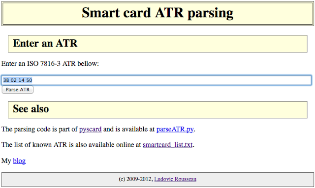
I made some graphical design (using CSS) for my Smart card ATR parsing online application.
I am not a web designer (you may have noticed). But I tried to make the interface nicer.
The new interface looks like:
If you want to work on a better design you are welcome. Contact me.
Related articles:
