Parsing an ATR: now more web 2.0 friendly
I made some style evolution of the online ATR parser at https://smartcard-atr.appspot.com/.
You can have a look at the previous articles on the same subject: Parsing an ATR and Parsing an ATR: now in color.
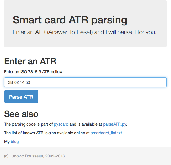
The main page now looks like:
I am not a web designer. So I used already defined style from Bootstrap.
The website follows the responsive design. The pages are now adapted to any screen size: desktop or smartphone.
If you have ideas to improve the design or add new features just contact me.
